Benefits of Novel Feed Ingredients
You may also like
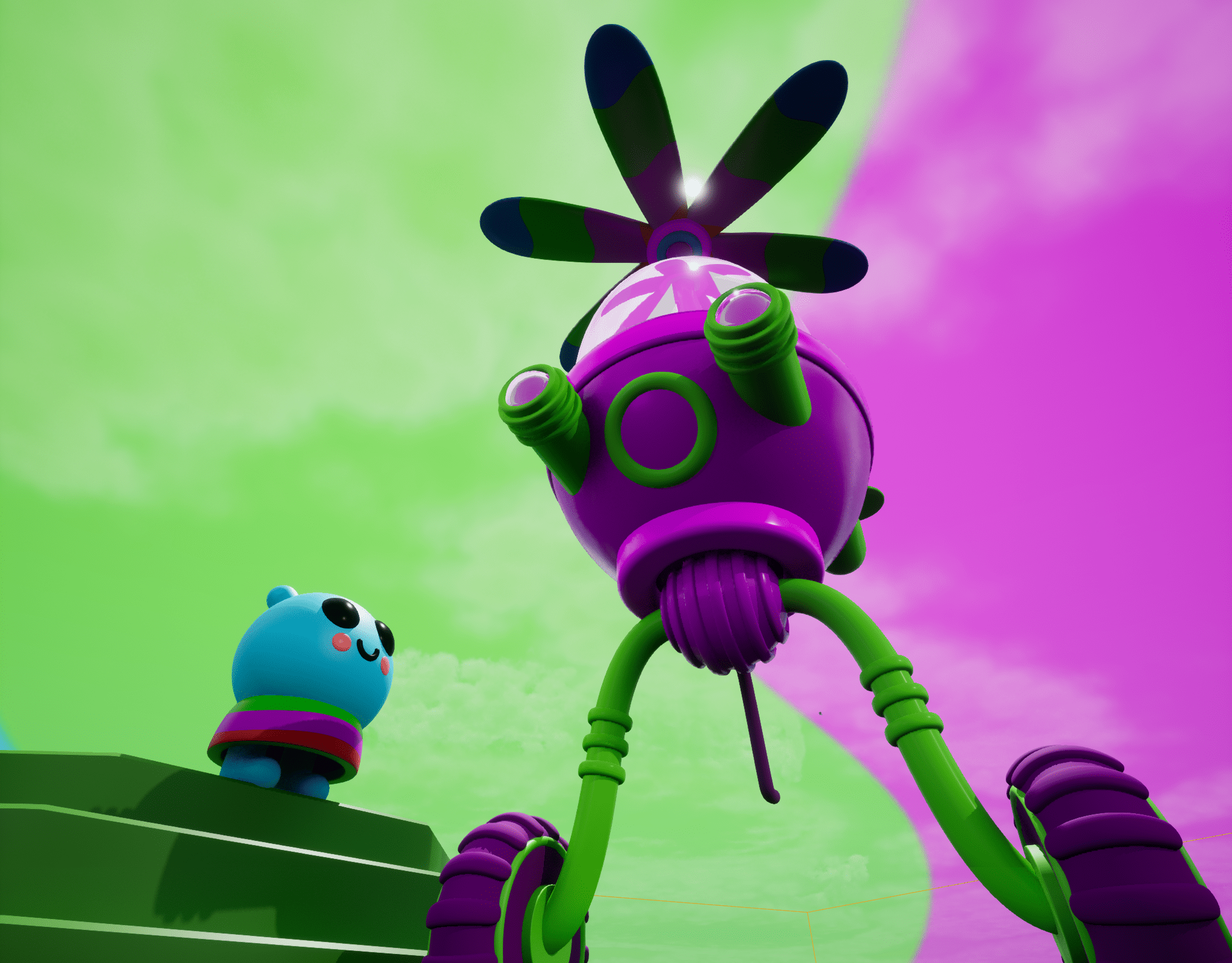
Kiku's Fantastic Flying Machine
2022
3D Modeling, Rendering in Unreal Engine
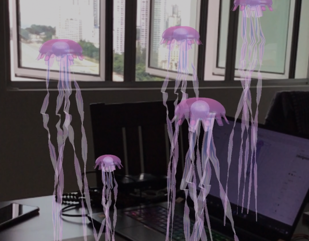
Jellyfish Dance: Inside
2021
Augmented Reality (AR), 3D Modeling, Animation
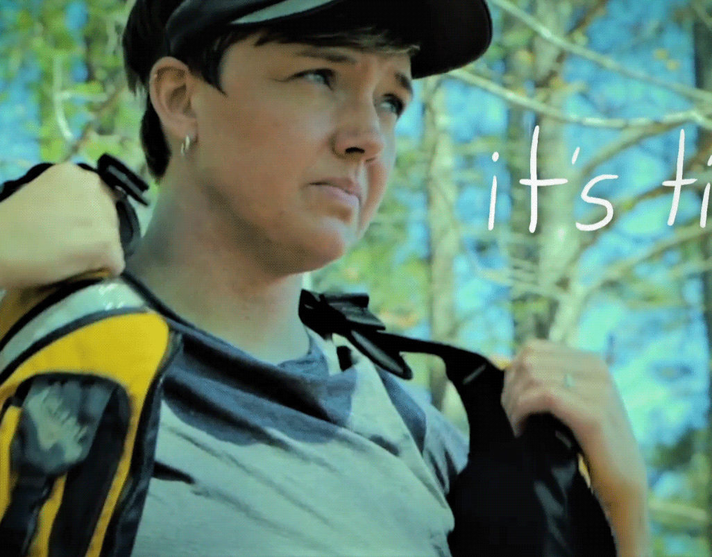
Emotion Kayak Motion Design
2019
Motion Design, Video Editing, Cinematography
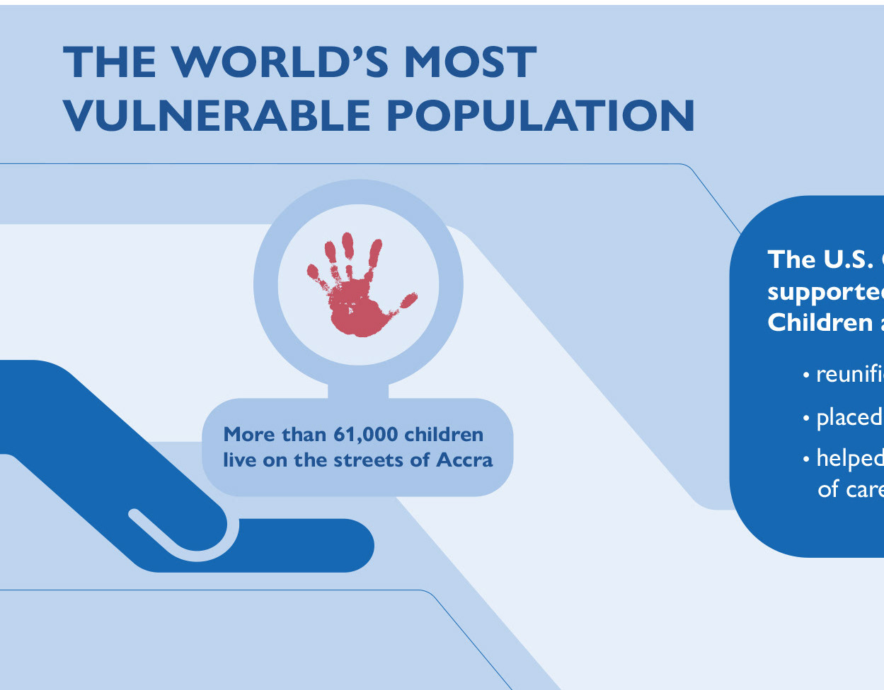
The World's Most Vulnerable Population
2025
Graphic Design, Illustration, Infographic
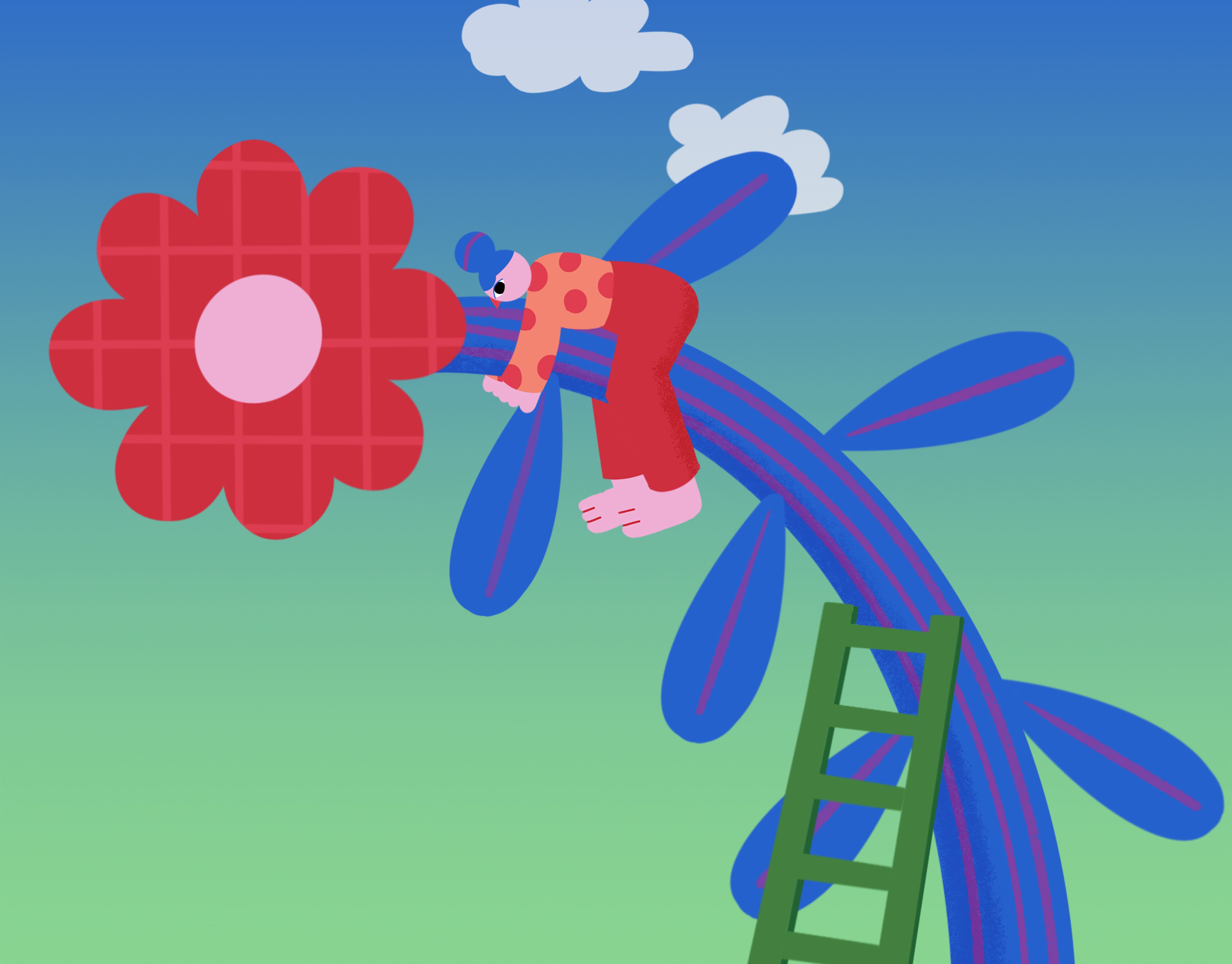
Flower Friend
2025
Motion Graphics, Graphic Design, Illustration
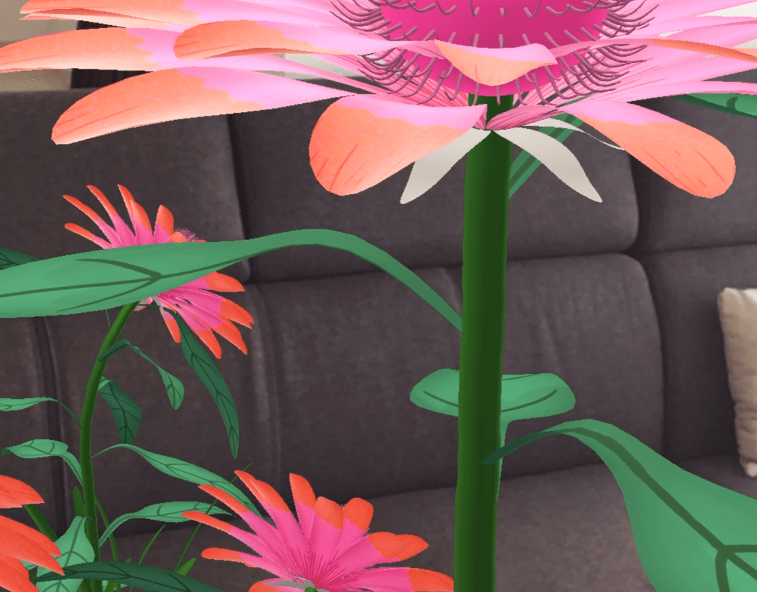
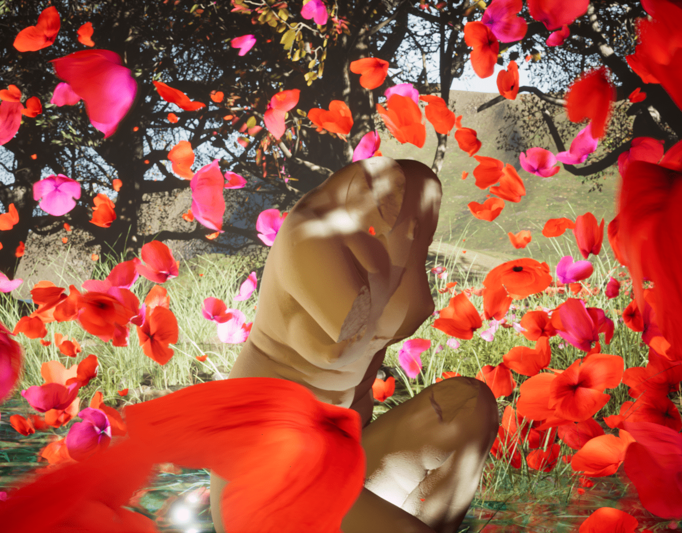
A Living Room Flower Garden
2021
Augmented Reality (AR), 3D Modeling, Animation
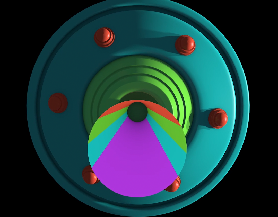
Just Another UFO
2021
3D Modeling, Motion Design
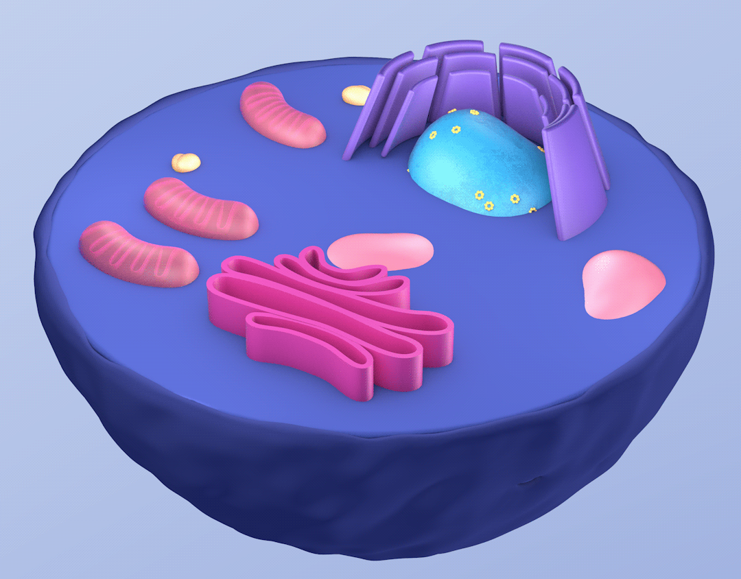
A Closer Look: A Series on Medical Models
2021
3D Modeling, Medical Animation
For the Love of Nature
2022
3D Art, 3D Motion, Motion Graphics
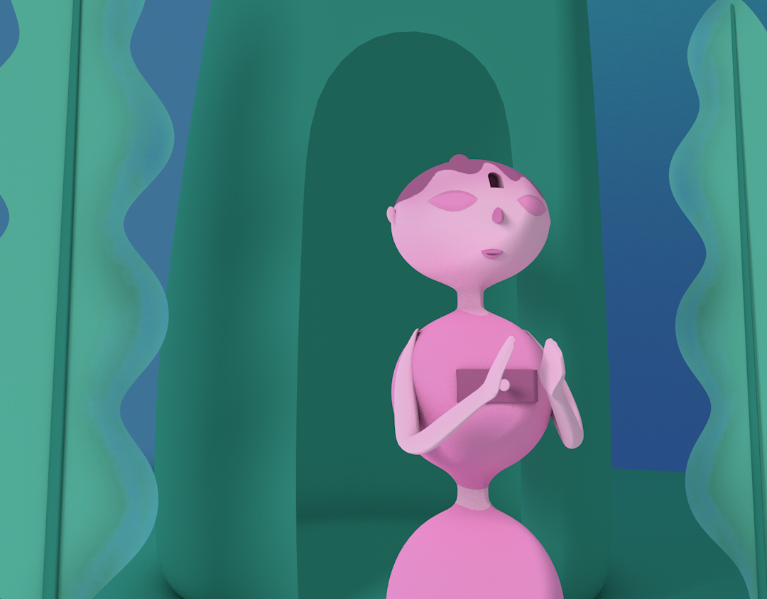
OM: Oorvi Meditation - Don't Give Up
2021
Character Design, 3D Modeling, Rigging, Animation